(Case study) Mortgages · Launched 2026
Carole Ann Bryant
A calm, personal site for an independent mortgage broker, with real calculators that let buyers see their numbers before they ever pick up the phone.
- Client
- Carole Ann Bryant, Mortgage Broker
Dominion Lending Centres Mortgages On Point - Location
- Georgetown, Ontario
- What we did
- Design, development, mortgage calculators

(01) The brief
Make a mortgage feel manageable.
Buying, renewing or refinancing is one of the biggest money decisions people make, and most arrive anxious and unsure what to ask.
The challenge
Carole Ann has been a mortgage broker for over 18 years, with access to more than 230 lenders through Dominion Lending Centres. Her clients stay with her for years because she’s easy to reach and explains everything. Her website needed to carry that same feeling: personal rather than corporate, clear about what a broker does, and able to answer the first money questions before anyone books a call.
Our approach
We built a quiet, editorial site with her own portrait and words at its centre. The site sets out three paths, purchase, renewal and refinance, each with a short guided explanation. Three calculators run the real numbers, including the Canadian stress test. Her clients’ own reviews follow, and every page leads to her secure online application.
- 18+years of experience
- 230+lenders behind every search
- 3live mortgage calculators
- 8client reviews on the page
(02) What we built5 parts
Answers first, then a conversation.
Each part takes away one worry, so by the time someone gets in touch they already know where they stand.
-
01
A warm first impression
The homepage opens on a handshake across a kitchen table under one line: “Your Journey Home Starts Here.” Her portrait, name, brokerage and licence number sit in the header on every page, so visitors always know who they’re dealing with.

-
02
Her story, in her words
The about section reads like an introduction rather than a sales pitch: her 18 years in the industry, how she works, and what she does when she isn’t working, from the garden to video calls with her grandchildren. Her licence details sit right beneath it.

-
03
Three paths, each explained
Home purchase, renewal and refinance each have their own panel and photo. Opening one shows a short guided explanation: what she’ll do, step by step, and why it matters. Each ends with a button straight to her application.


-
04
Calculators that do the real math
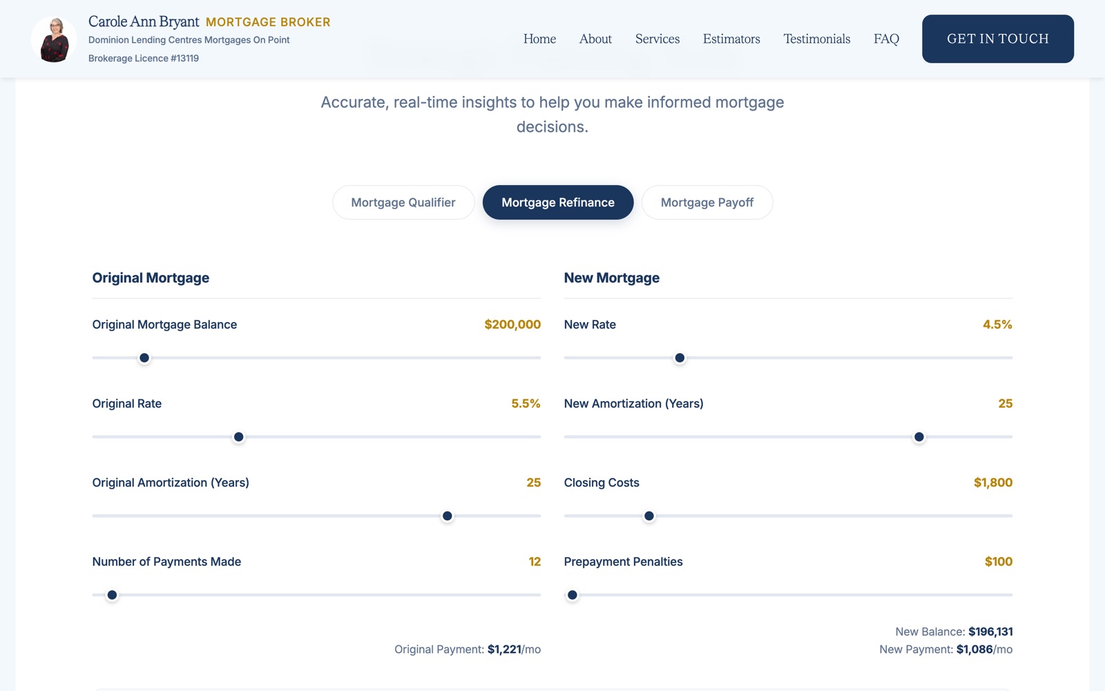
Three tools sit behind one row of tabs. The qualifier estimates buying power under the Canadian stress test, lender debt limits and CMHC insurance. The refinance tool weighs interest saved against closing costs and penalties. The payoff tool shows how extra payments shorten a mortgage. Every number updates as the sliders move.

-
05
Her clients, in their words
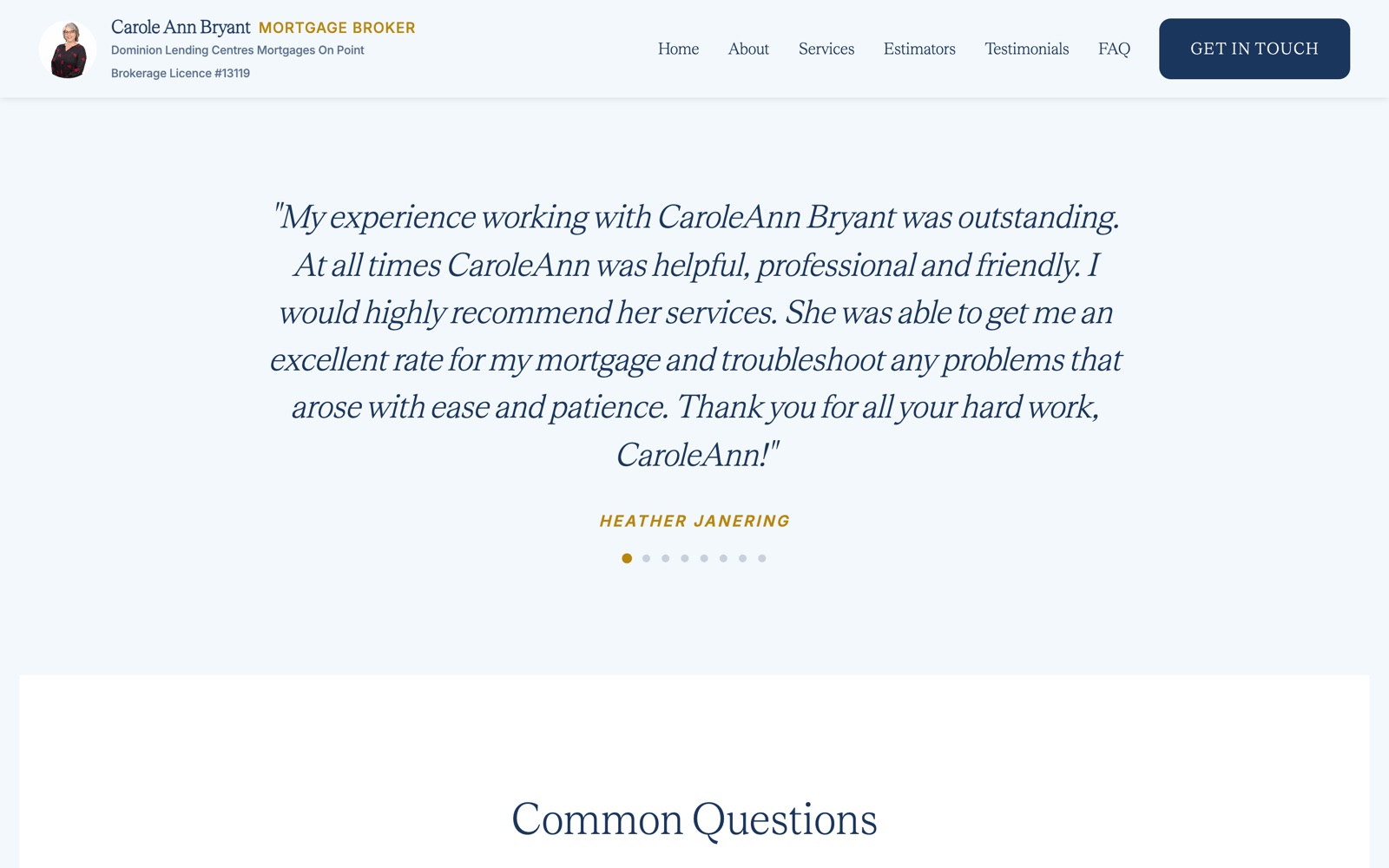
Eight reviews from first-time buyers, repeat clients and families who have moved with her more than once, set large and one at a time. A short FAQ follows, covering what a broker costs and how a rate hold differs from a pre-approval.

(03) On the phone
Numbers that fit in a palm.
People check what they can afford on their phones, often while looking at listings. The calculators’ sliders and tabs were laid out for a thumb.



(04) Under the hood
Light, secure and easy to trust.
A broker’s site handles people’s first questions about money, so it has to be quick, private and dependable.
01 · Calculators in the browser
Every calculation runs on the visitor’s own device, so no financial details are sent anywhere just to see a number.
02 · Straight to the application
Every call to action leads to her secure online mortgage application, which opens in a new tab so the site stays where they left it.
03 · Enquiries without spam
The contact form is checked by Cloudflare Turnstile and delivered by a small serverless function through Resend, straight to her inbox.
04 · Static and quick
Built with Eleventy and served by Cloudflare Pages, so it loads fast and leaves nothing to patch or update.